


Advance Publications is a national news conglomerate, focused on digital and print media. Across native apps and web, they have 50+ million monthly unique users.
In the past four years, local news coverage skyrocketed due to heated election debates, tax reforms, local government changes, and non-stop Coronavirus coverage. According to INMA (International News Media Association) Researcher Gregorz Piechota, just this past year, news publication site traffic doubled, which turned even the most casual reader into an avid reader overnight. The surge in content views and daily traffic did not go unnoticed.
Historically, Advance’s revenue came from two places: physical newspaper delivery, and ad placement revenue. With this boom in traffic, Advance introduced a third revenue stream – gating premium content behind a subscription paywall.
In Q3-Q4, the KPI for the Digital Consumer Revenue team was to increase the overall “known user” base by 40%.
Why known users vs revenue? The company is currently integrating a CDP (customer data platform). This will provide the company with customer profiles, which tracks the stories a user reads.
A benefit to this is potentially gating relative content to a “known user” through machine learning. Whereas one reader may have all coronavirus coverage behind a paywall, another reader may have all local politics blocked.
To hit that target, a series of single variant A/B tests were performed. The tests launched email walls vs paywalls, limited time discounts, and value perception tests.
Focused on this goal, a roadmap and resource plan was crafted for the design and research team:
• Facilitate A/B test prototypes that test a control vs new variant.
• Launch a study in perceived value, and unearth a reader’s current perspective, and desires for the product.
• Create a robust, reusable component library using a design system that can scale across web and app.
• Align messaging touch points through intercepts, paywalls, and offer screens, to foster trust and purchase consideration.
• Remove any friction or obstacles from the checkout experience.
When I joined the team last year, subscription paywall revenue was still considered in its discovery phase. Advance was behind the industry to adopt a subscription revenue model, and only 5% of articles had a paywall (all manually hand-picked).
The marketing and analytics team performed dozens of A/B tests across 10 regional markets, testing copy and pricing. However, the quantitive data was not giving many answers. Our team, comprised of design and ux research, knew the power of qualitative data, and began a case study in customer-perceived value, which is the pursuit of a prospective customer's evaluation of the benefits, costs, and design of one product when compared with others.
We began this study with an audit of screens, and later, a complete user journey from off-site to on-site, all the way to checkout.
From the experience audit, we provided a list of assumptions based off of perceived value to our readers.
Assumptions
• Product looks “generic,” and doesn’t look like it has paid “premium” content (validated)
• Readers do not understand the benefits and value of purchasing a subscription (validated)
• Having too many ads makes the product look free (validated)
• Premium features did not motivate a power user to pay for our product (validated)
• Subscription price point is too expensive for local news (validated)
• Users believe news should be free to read to the public (validated in some markets but not all markets)
• Readers will pay for premium content they have an interest in (assumption)
• Checkout experience has a lot of friction (validated)
• Reading content within an app vs website feels more “premium” (assumption)
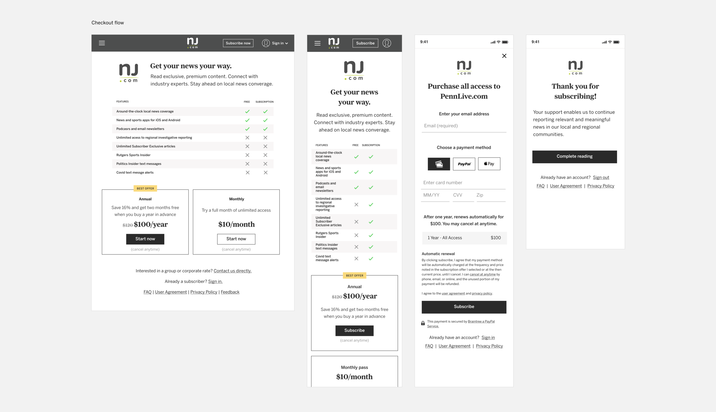
Our comparative and competitive analysis began to tell an interesting story. Our first observation was several competitors use a high contrast visual aesthetic, with custom imagery, and high quality photography. This aligned well with our hypothesis -- linking luxury brand aesthetic to our brand will influence and increase subscriber conversion.
• A high contrast color palette that is “white label” to be used across Advance’s 10 local markets
• ADA and WCAG compliant
• Minimal, clean aesthetic
• Straight lines and edges
• Sophisticated display fonts with nod to “newspaper” heritage
• A design system with reusable components
Tested for 15 days in our largest local market, the redesigned subscription flow delivered an impressive 45% increase in conversion versus the control. In addition, the portion of the sales that were annual were 25% higher than the control.
The vertical layout of the test template was the strongest of the two layouts. Vertical conversion was 15% higher than horizontal, and 54% higher than the control. It also produced the highest proportion of annual sales. Annual sales from the vertical template were 35% higher than the horizontal, and 40% higher than the control.
After validating our assumption that a premium brand aesthetic would increase sales, we continued to make incremental updates throughout the product experience.
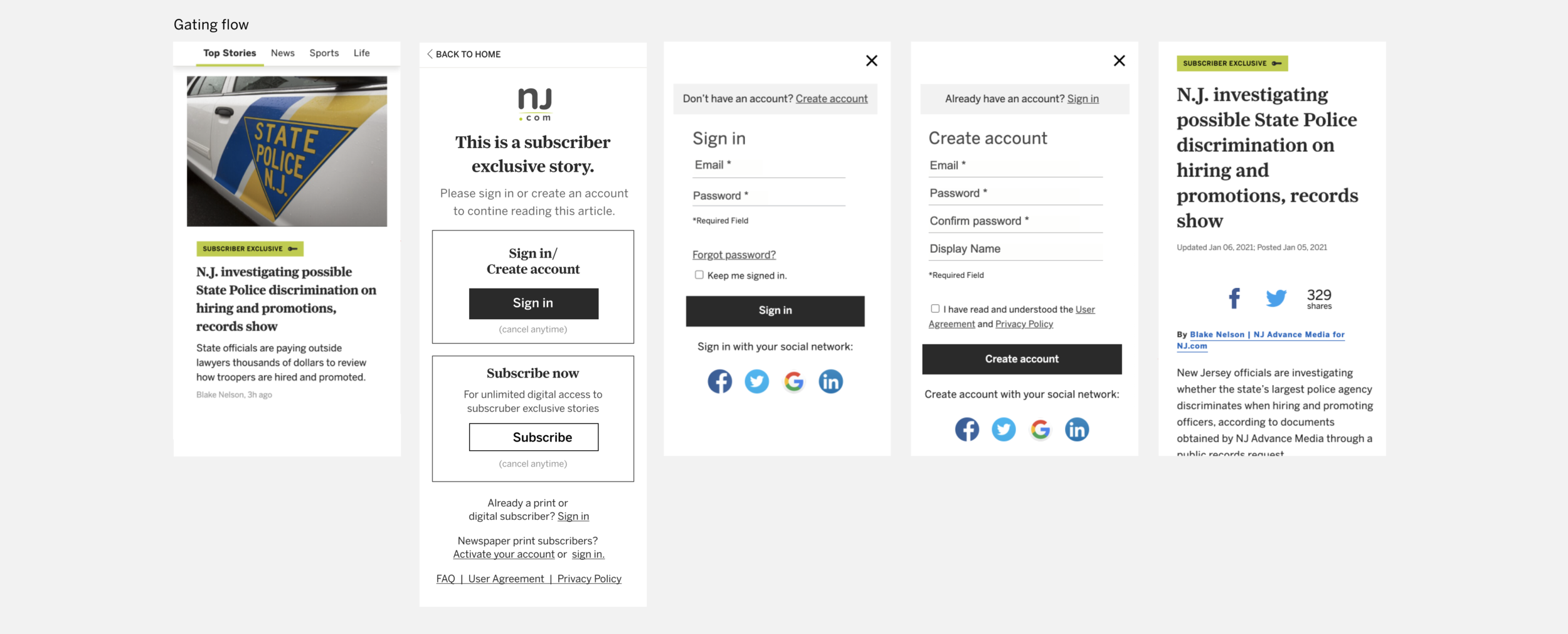
To scope the work that needed updating, we performed user journey mapping. A reader can enter our website from several avenues: Google, Facebook, Twitter, newsletters, and text messages.
This exercise helped outline how many interaction touch points are presented to a reader before giving them a hard stop, and asking them to make a purchase. We categorized each touch point in an affinity map to understand the commonalities and differences.
We continue to improve and evolve the product based off research, and industry standards. While still in concept, most recent research suggests that hard “non-dismissible” stops are the key to conversion.
Additionally, phasing out modals, and displaying a hard stop within an article page provides additional revenue opportunities for ad placement.
Lastly, we’ve learned about our audience from user surveys. We know what our power users want: the capability to ”read it later,” access to news archives, recommended content, and the reduction (or complete removal) of ads in a paid subscription. Our goal is to accomplish these desires within the next year to provide the most premium experience to our readers.